




Built for mobile-first products
Designed around real mobile app patterns. Layouts, spacing, and components are optimized for production, not static demos.
Production-ready components, templates and tokens from shipped apps, in light and dark. Make it yours in one click with Theme Builder.
Used by 1,000+ designers
Every component is connected to Figma variables. Customize them your way, and the whole kit follows.
Designed around real mobile app patterns. Layouts, spacing, and components are optimized for production, not static demos.
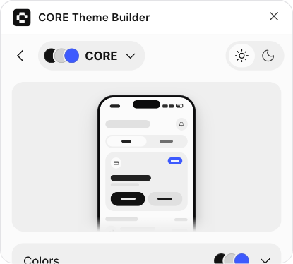
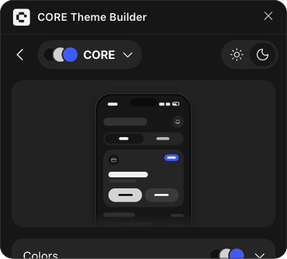
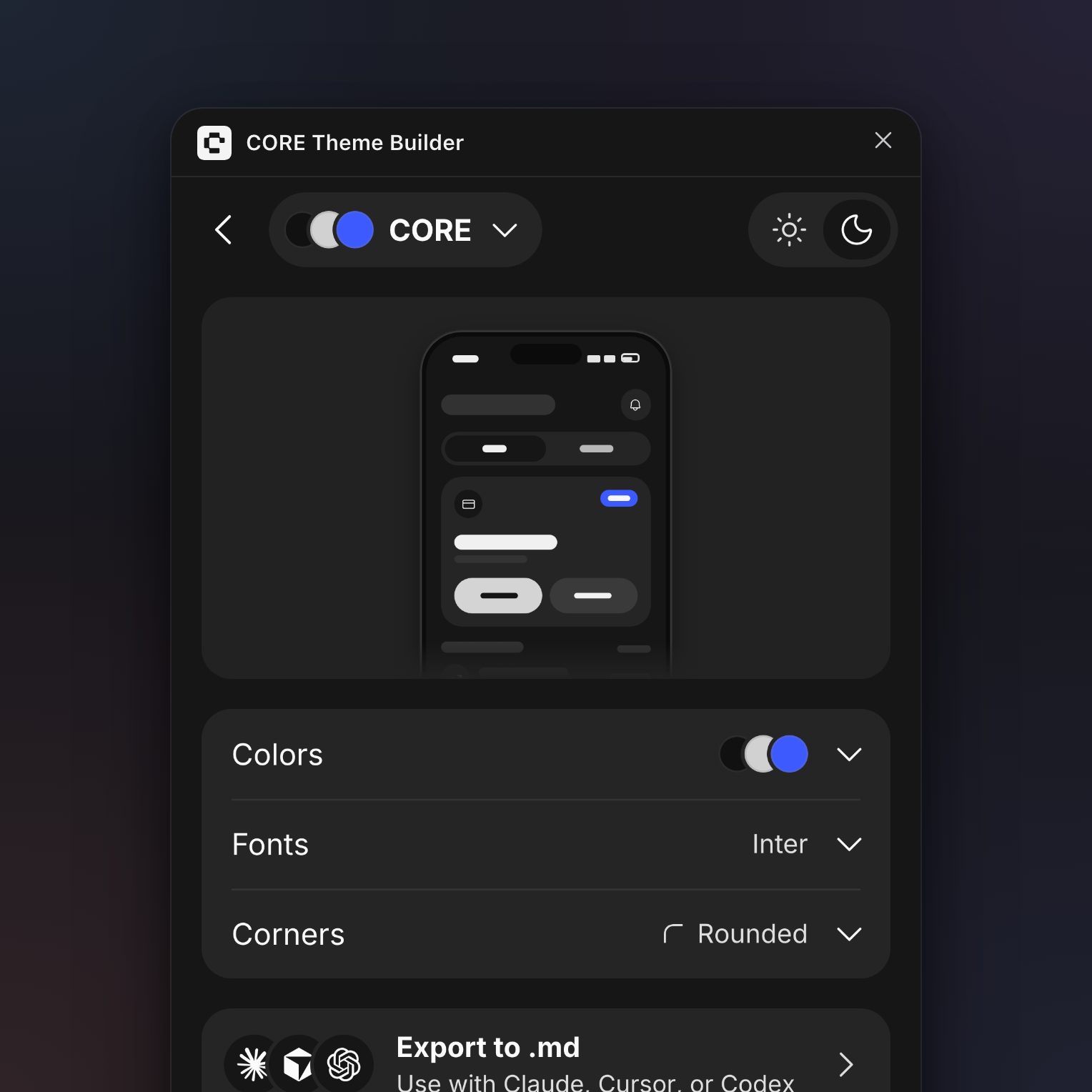
Pick one of nine ready-made themes or set your own colors, fonts and corners. CORE Theme Builder restyles every component in light and dark.
Components are built with Figma variables and Auto Layout to stay flexible, predictable, and scalable.
Native support for light and dark modes with consistent contrast and structured color logic.
Text, icons and control outlines meet WCAG 2.1 AA contrast in light and dark, and every theme you apply keeps them readable.
Turn your theme into one Markdown file with every color, font and corner, ready for Claude, Cursor or Codex to style your app.
No bloated variants or unnecessary abstractions. Only what’s needed to move fast without breaking the system.
Onboarding, home, payments, profile and empty states, in light and dark, built from the same components.
Short walkthroughs help teams understand the system quickly and apply it to real projects.
Start with a clean system, customize themes in minutes, and scale designs without losing consistency.
Get the CORE Mobile UI Kit, Theme Builder plugin, and Icons plugin in one package.
Pick a theme or set your own colors, fonts and corners with CORE Theme Builder.
Build consistent designs with reusable components, icons, and design tokens.
A Figma plugin that restyles the whole kit in one click: nine ready-made themes or your own colors, fonts and corners, readable in light and dark, with an export to .md for your AI coding tools.
Open Theme Builder(opens in a new tab)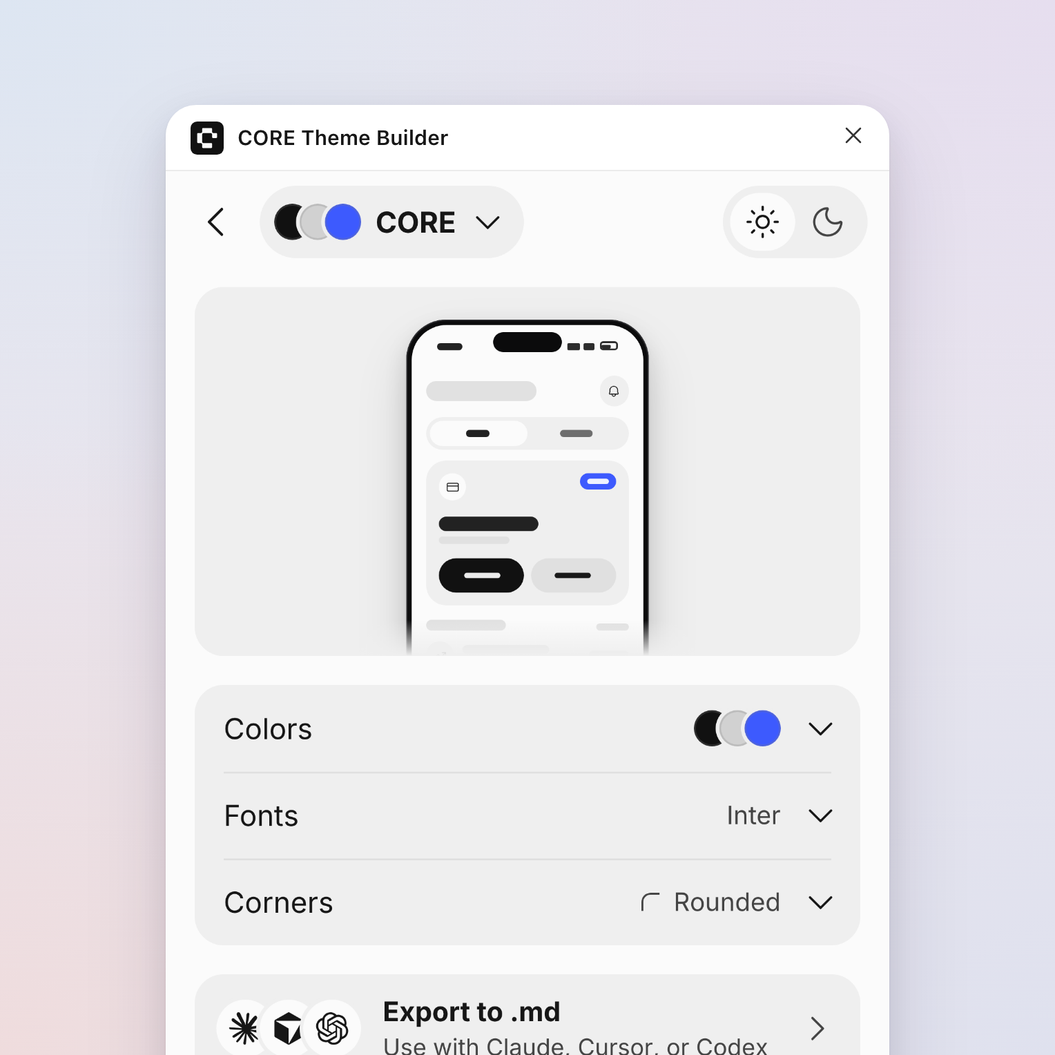
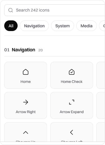
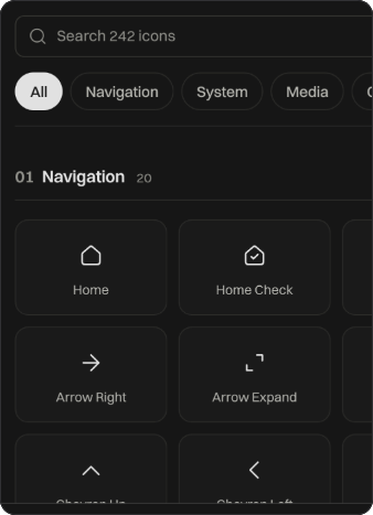
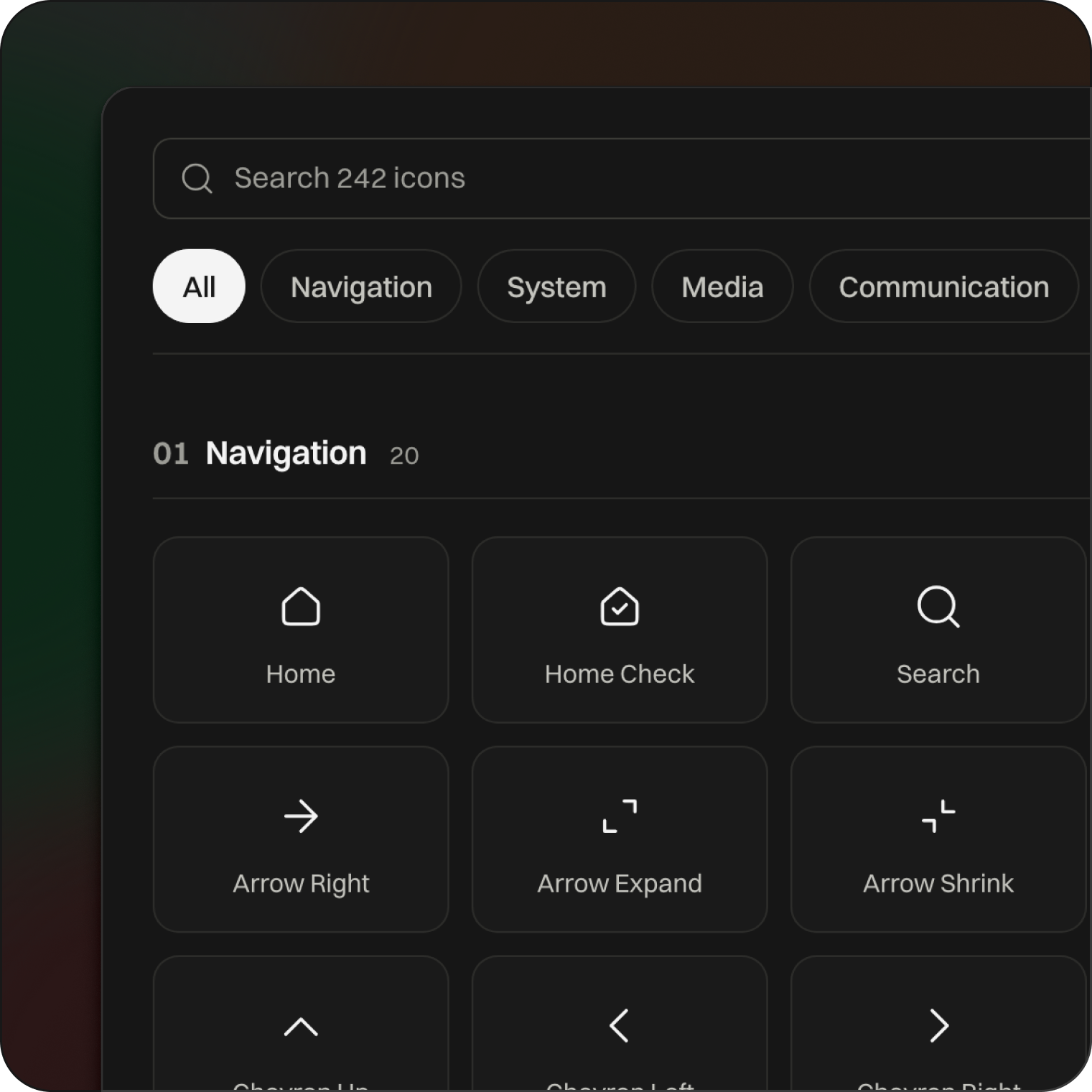
A curated icon library and Figma plugin for modern digital products, with consistent sizing, strokes, and alignment, so you can build cohesive interfaces faster.
Open CORE Icons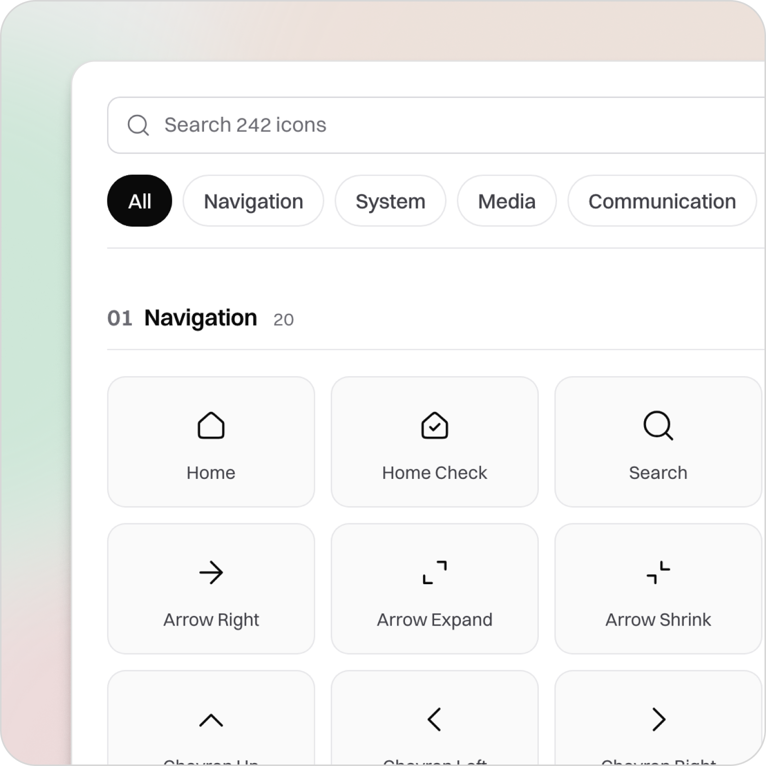
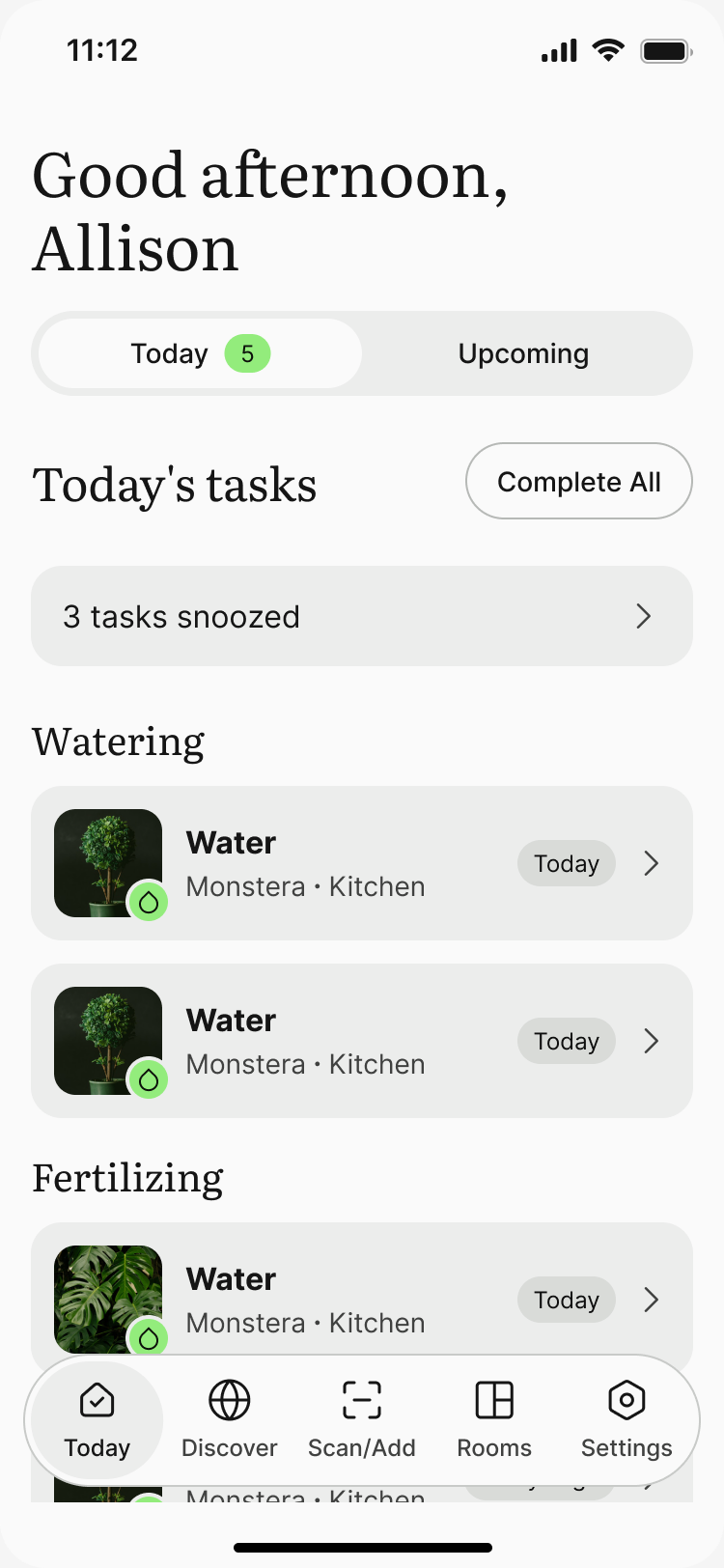
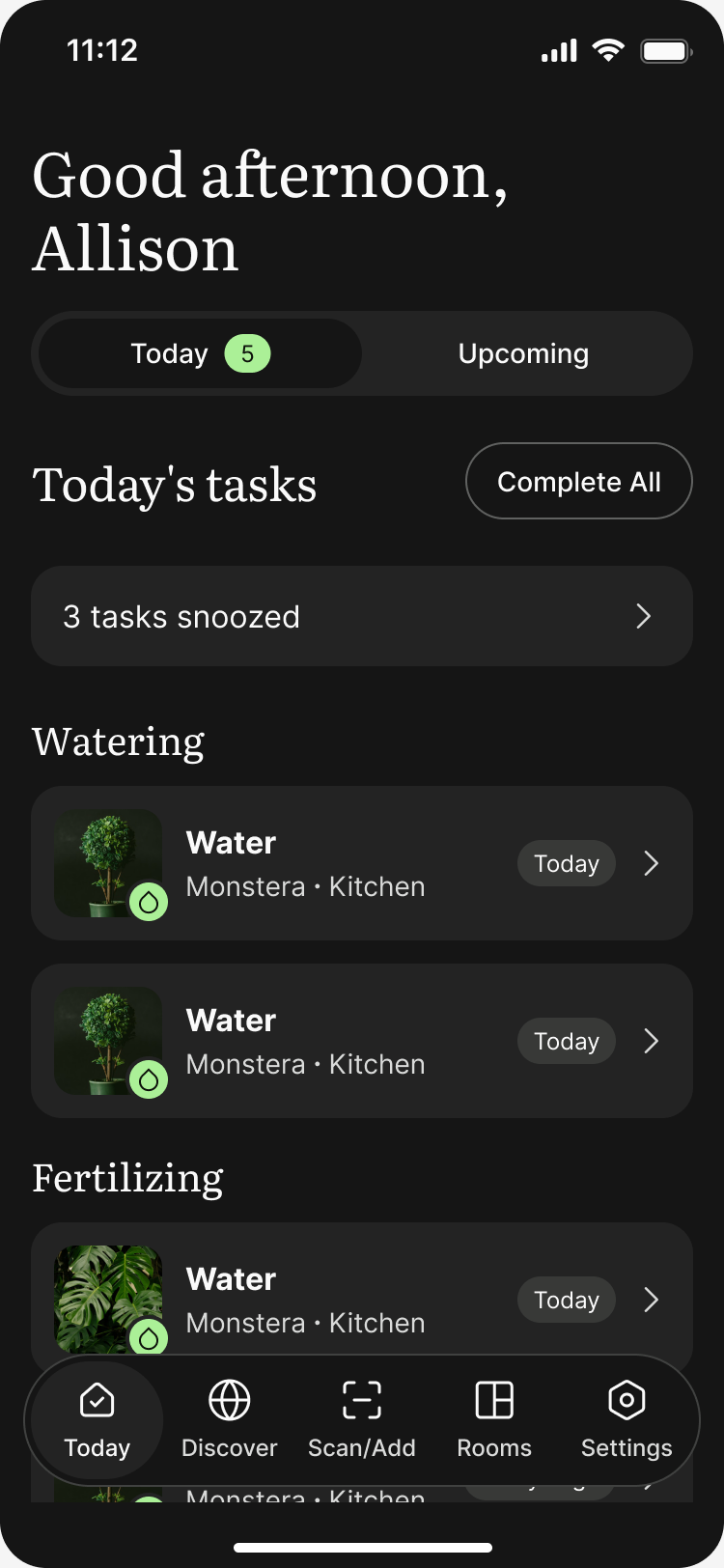
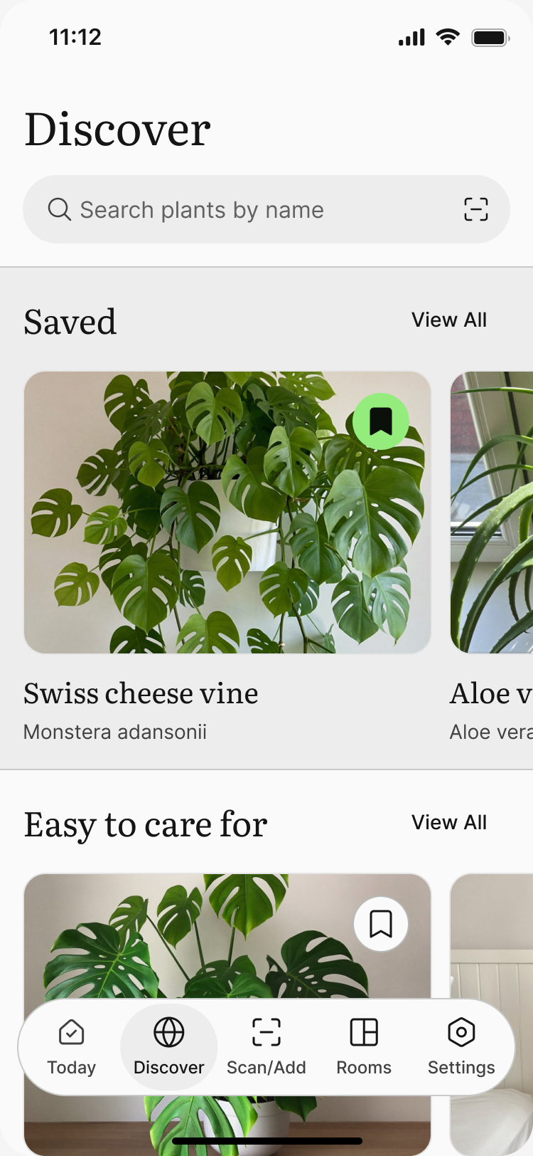
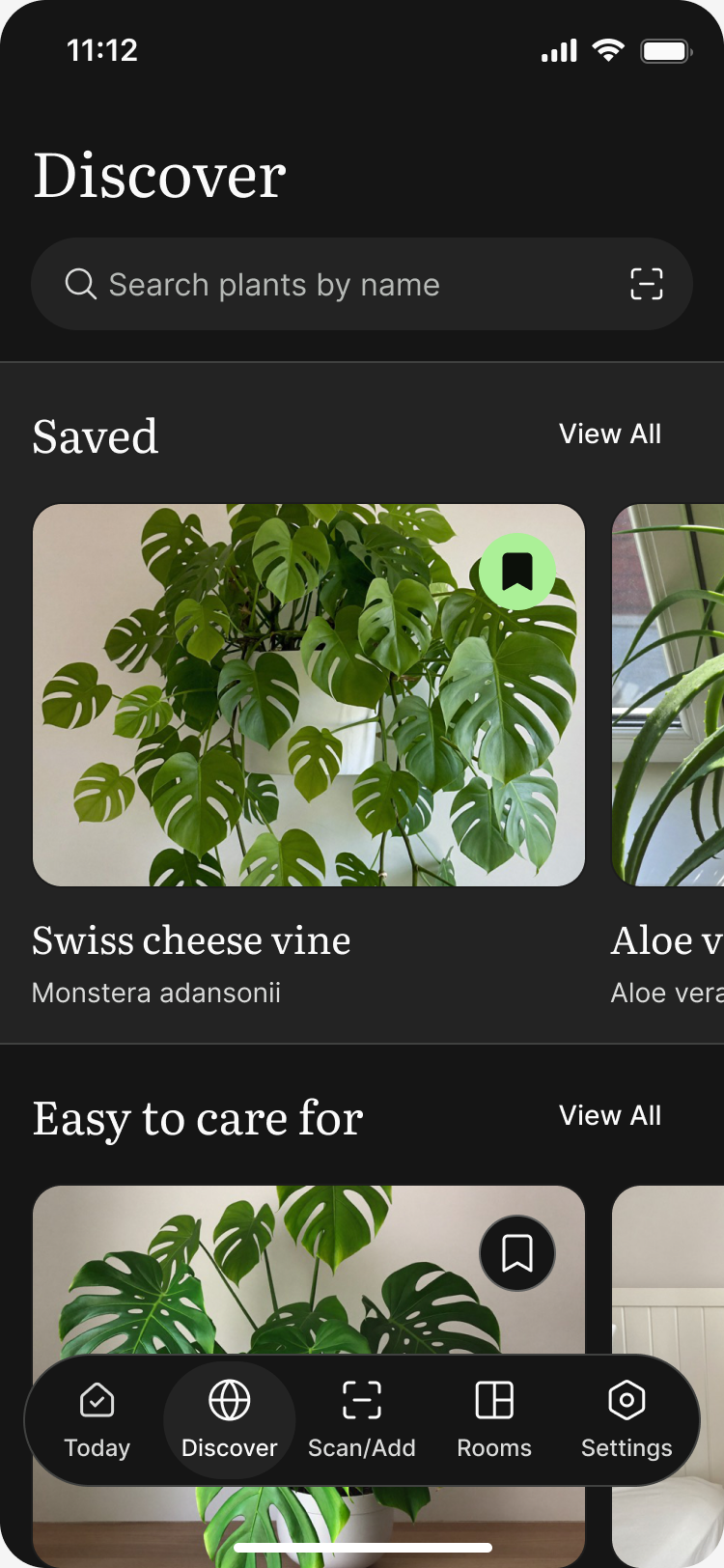
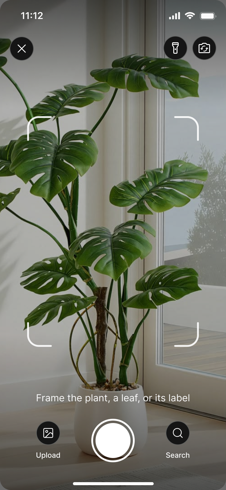
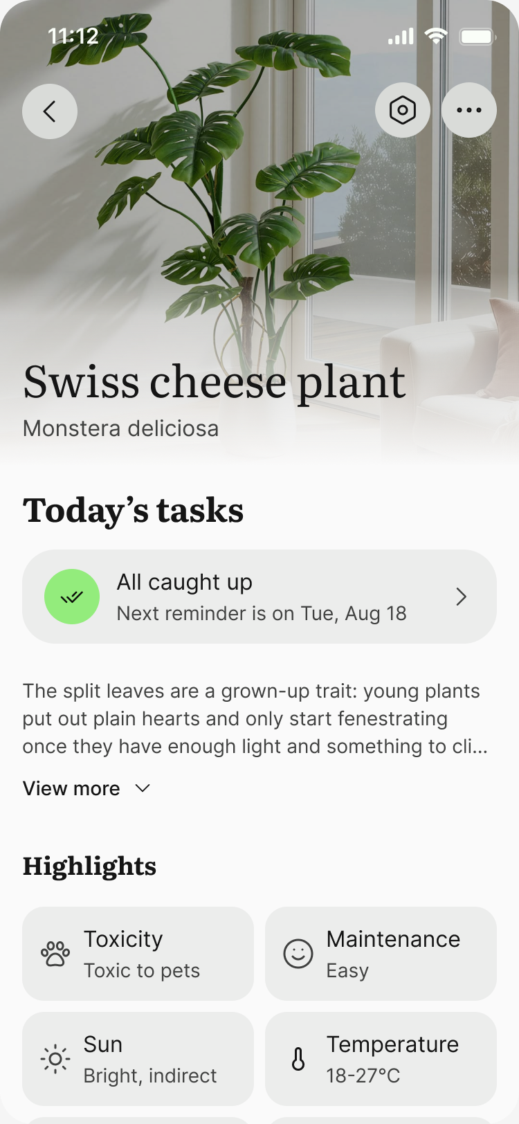
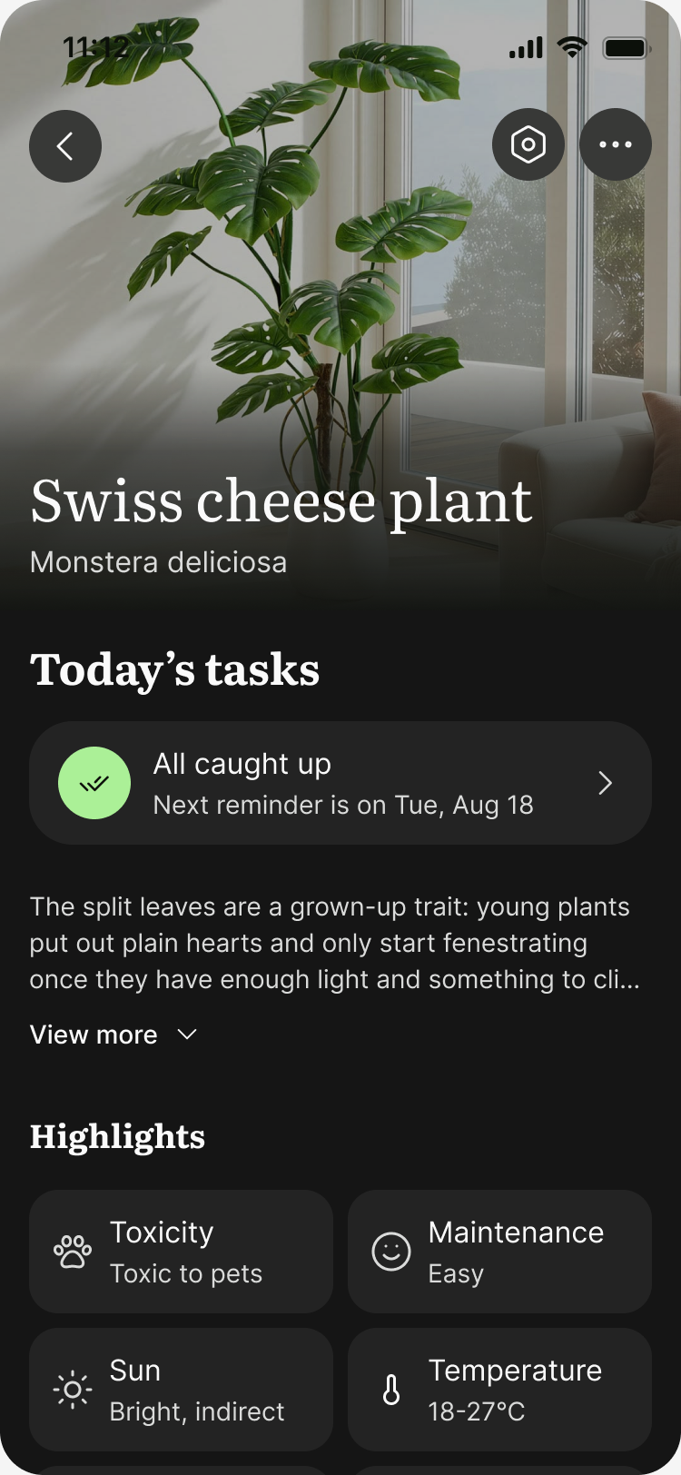
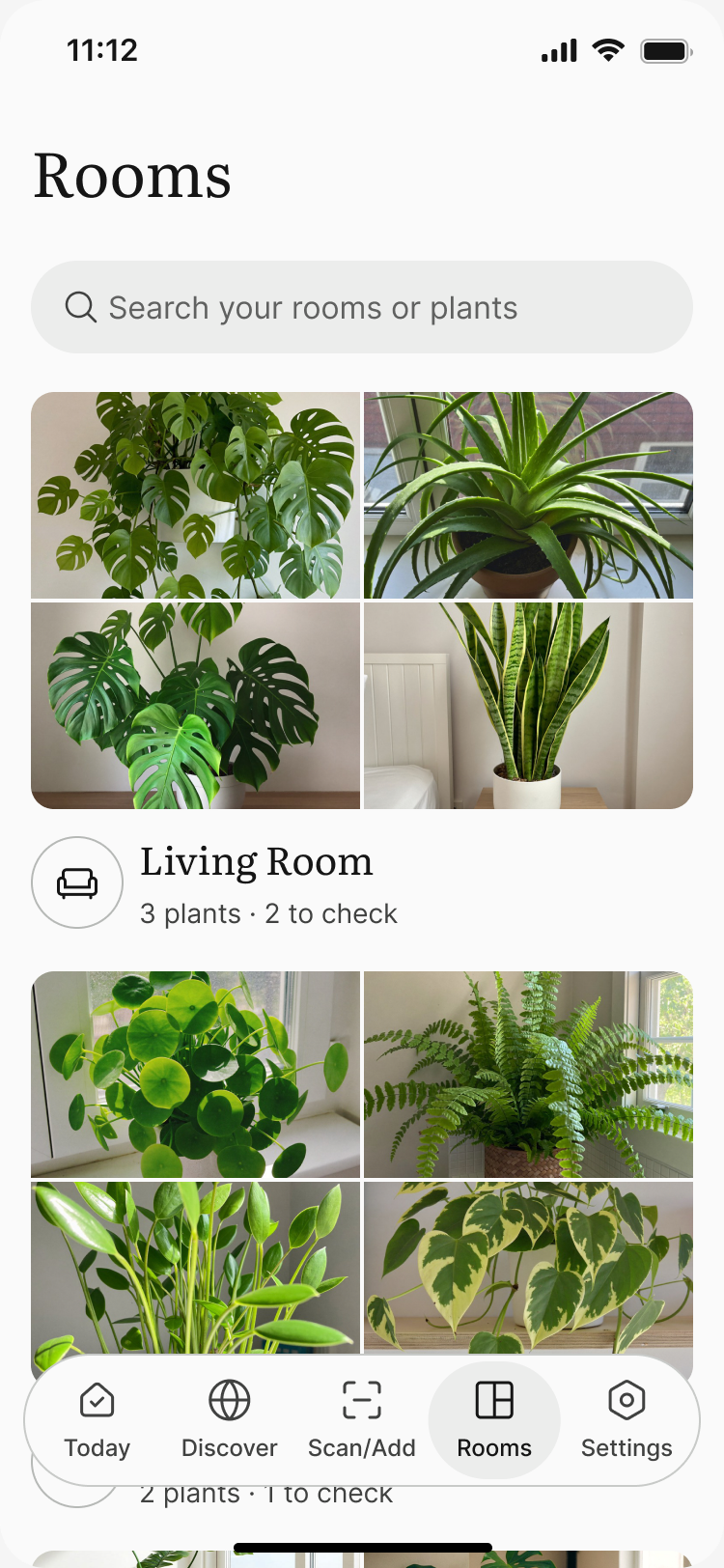
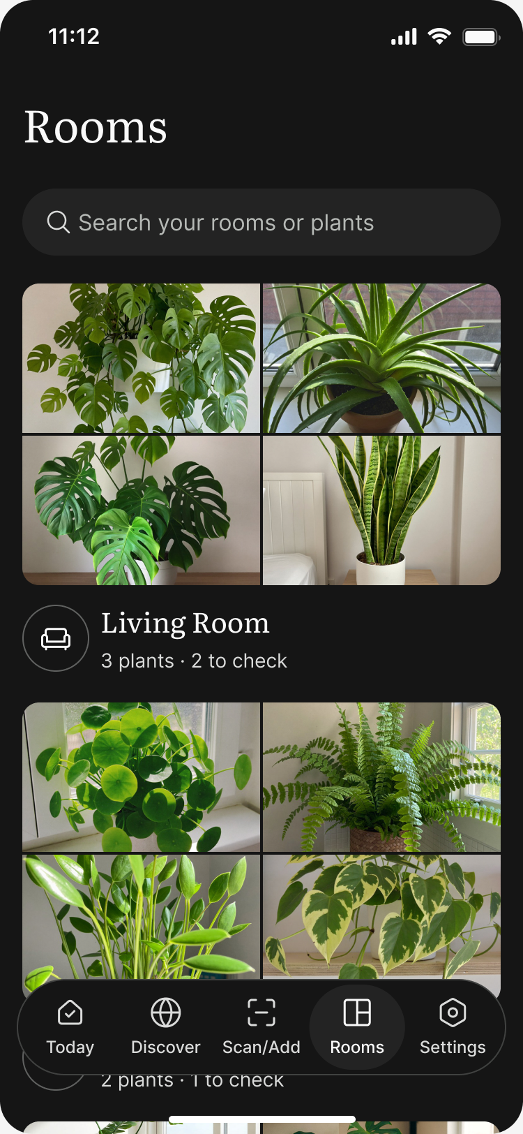
Every screen of a shipped plant care app, built from the kit in light and dark.

Scan a plant, set up its care schedule, and get reminded whenever it needs you.
| Build with AI | Prebuilt with CORE | |
|---|---|---|
| Cost | ~$320 | $79 |
| Estimated tokens | ~250M | None |
| Time to start | 20+ hours | Minutes |
| Tested in real apps | No | Yes |
Estimated based on Claude Opus 5.5 API rates: about 250M tokens for an AI agent to rebuild CORE in 2 to 3 passes.
Basics prebuilt. Focus on what matters with
Common questions about CORE, pricing, updates, and customization.
CORE is a premium mobile-first design system for Figma that helps designers build, customize, and scale mobile products faster. It includes a UI kit, Theme Builder plugin, Icons plugin, and a growing library of resources designed for modern product teams.
CORE is built primarily for mobile products and mobile-first workflows. While many components can be adapted for web projects, the system is optimized for designing modern mobile experiences.
CORE includes the Mobile UI Kit (31 components with usage examples, light and dark themes, 391 variables and 25 ready-made templates), the Theme Builder plugin, and the Icons plugin: everything you need to create consistent, scalable interfaces and customize them in seconds.
Yes. CORE is built around variables, themes, and flexible components, making it easy to adapt colors, styles, and branding across an entire product.
Yes. CORE 2.0 (October 2026) added seven components, including Dialog, Accordion and Code Input, and 25 ready-made templates. New components, templates and tools keep coming, and every update is included with your purchase, so 1.0 owners get 2.0 at no extra cost.
The CORE Mobile Starter Kit is a one-time purchase with lifetime updates: $79 for one designer, or $199 for a team of up to 5 designers in the same company. It bundles three products: the Mobile UI Kit, the Theme Builder plugin, and the Icons plugin.
Because CORE is a digital product, refunds are generally not available once access has been granted. If you run into a technical issue, receive incorrect files, or believe there is a valid reason for a refund, get in touch through the contact page. Every request is reviewed on a case-by-case basis.
Be the first to know when new components, templates, and releases ship.
We use analytics cookies to understand how people use this site, as explained in our privacy policy.